top of page

Workking
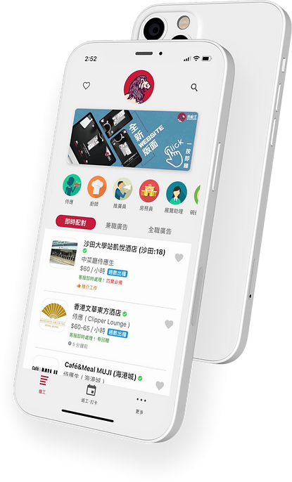
Casual work platform for slashers
Owner
Mission
My Role
Tools
Workking
Create a new branding image to attract youngsters for our casual job seeking platform
Product branding, UI Design, Graphic Design
Sketch, Adobe Illustrator
Workking—a casual job-seeking platform is looking to target younger users. Therefore, a rebrand was needed at the time.
By the time of 2018, Localism was becoming a trend for youngsters to to learn to appreciate the beauties of local Hong Kong culture. This rebrand rides on the ongoing trend and pushed Workking towards a local, young, and stylish style.

Conceptualization
Base on the above guiding principles, I started to create a mood board by gathering old Hong Kong graphic materials and photos.
Our team also found that local breweries are doing a good job at creating the trendy local vibe, it brought influence to our direction.


Early draft
Fun fact: by the time when the first draft was created, I experimentally put our branding draft on a glass bottle as a tribute to local breweries


The final form
In the following revisions, we brought brighter red with a combination of purple to enhance the brighter younger vibe as opposed to vintage Hong Kong brownish-red. Let’s take a look at the final version of the Workking branding


bottom of page
